
ASL-LEX: A Visualization of American Sign Language
Mar 15 2017
Since the fall of 2014, I’ve worked as a fellow for Tufts’ Academic Technology department. As an AT Fellow, I worked on a number of research and education-based technology tools that have been based in a variety of academic department (economics, biology, physics, philosophy). One of my favorite projects during my time as an AT Fellow was the ASL-LEX project, which is based off work from researchers at Tufts, Boston University, and San Diego State University. ASL-LEX is a database and visualization of lexical and phonological properties for nearly 1,000 different signs of American Sign Language. The tool is designed to help teachers and parents teach and promote ASL vocabulary to K-12 students.
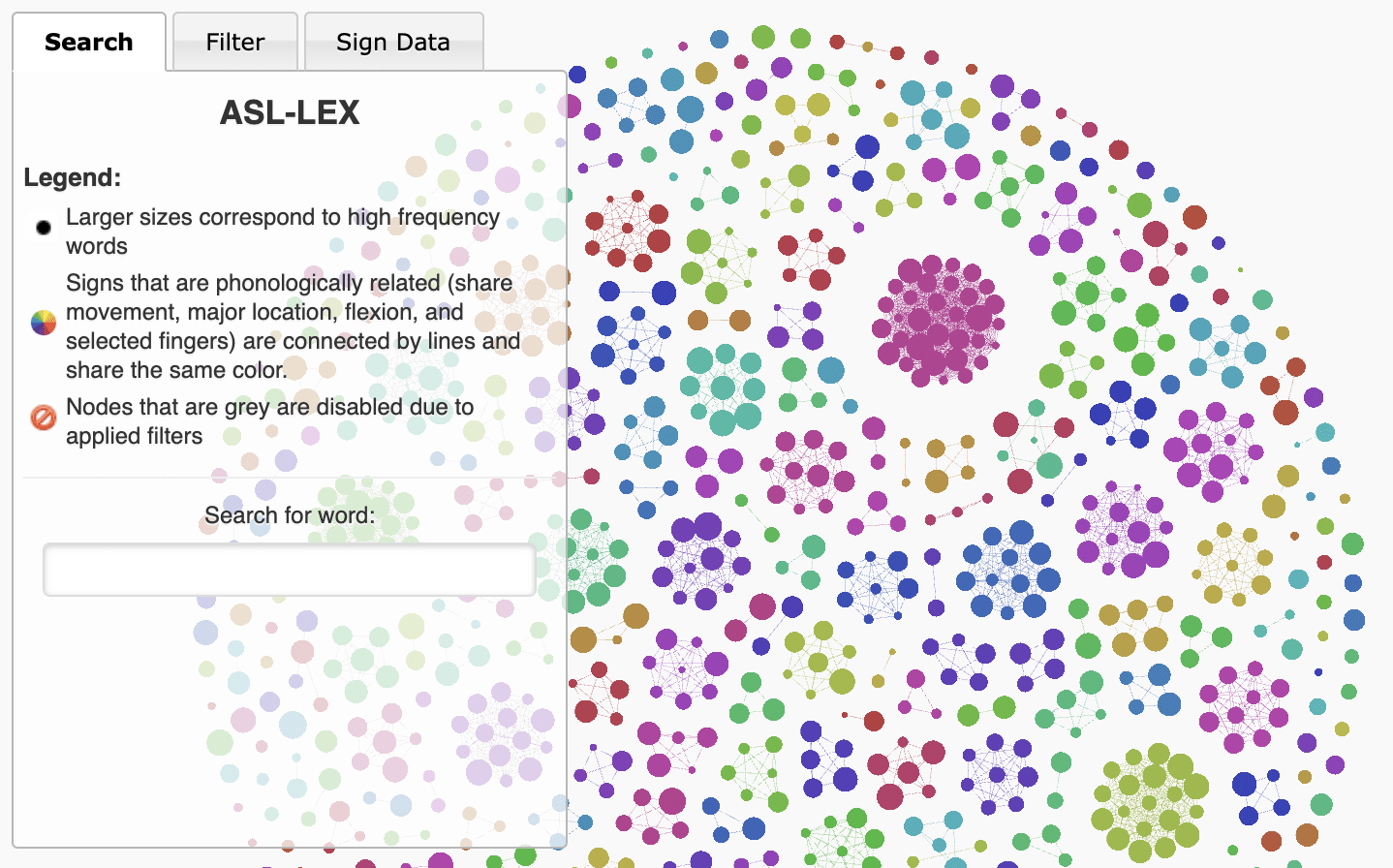
The visualization shows a network of nodes, where each node represent a single sign. Larger nodes represent signs that occur more commonly and connections between nodes show signs that are phonologically related (those that share movement, major location, flexion, and/or selected fingers). This makes it so that clusters of signs signify a group of signs that look similar, even if they don’t necessarily have similar meaning. You can search for specific signs as well as apply phonological and lexical filters to limit your search. When you click on a specific node, you are presented with information on the associated sign, including a video of the sign being performed.
I decided to highlight the project here and now because I found out that the visualization was actually named one of the Best Interactives from National Science Foundation’s 2017 Vizzies Awards, which is kind of incredible! This project was super cool to work on with the team, but it’s always fun to get some recognition as well.
All the thanks and credit in the world to the team (Naomi Caselli, Karen Emmorey, Zed Sevcikova Sehyr, and Ariel Cohen-Goldberg, among others) who conducted the research and conceptualized the visualization. I was lucky enough to put together the visualization/website, but none of it would have been possible without their incredible work.
You can read more about the project (as well as play with the visualization) on this site. You can also view the underlying code for the visualization in this Github repo.