
What Does the Public Think About Confederate Monuments?
Oct 27 2017
I recently came across an article from KUT, Austin’s NPR station, about Confederate statues with the following news graphic:
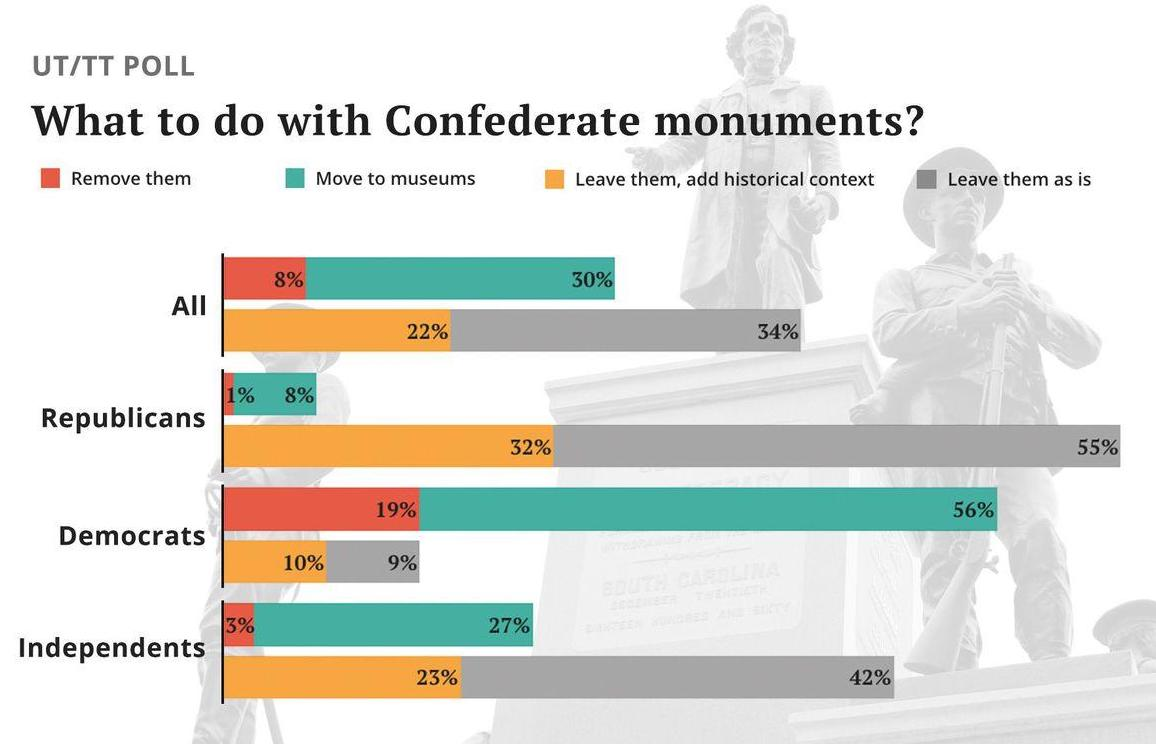
The contents of the graphic and the results of the poll were interesting, but more than anything, I was intrigued by their choice of chart type. On my first viewing, it took me a second to mentally reconcile what exactly was going on. What were all the bars? Why all the colors? I then noticed the clustering and realized it was not just any bar chart, but instead a clustered and stacked bar chart. It’s now clear they wanted to emphasize the contrast between the “move or remove” responses and the “leave them” responses, but with so many bars and mixed colors, I found myself lost in comparisons.
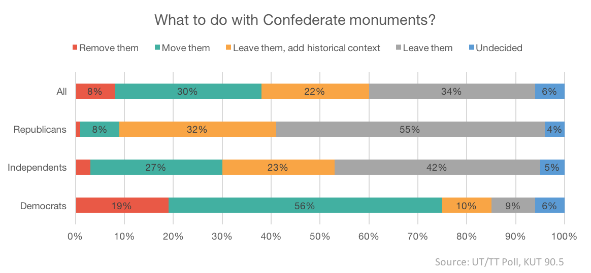
In an effort to think about how I would tweak this chart, I immediately jumped to the idea of using a 100% stacked bar chart. I quickly threw one together (see below) but it still just didn’t seem right. In this styling, I think the groupings (Republican vs. Independent vs. Democrat) becomes a little more clear, but this chart lost the contrast between the “move or remove” and “leave” responses that was present in the original graphic. Ultimately, I don’t think this was much of an improvement and was actually more of a step back.
While the 100% stacked bar chart wasn’t exactly what I was looking for, it did remind me of an article from Andy Kirk and his “little of visualization design” series. In the post, Kirk talked about improving a 100% stacked bar chart on lies in politics by turning it into a diverging stacked bar chart. Kirk said that this change would help emphasize the polarity in the chart and I knew this was exactly what I was looking to do for the KUT chart. So I took a whack at remake #2, leading to the diverging bar chart below, which I think is a winner, or, at the very least, an improvement.
At the end of the day, this was all mostly just an exercise for myself. KUT did a good job with their chart and more importantly with using their chart as one of many parts to tell an interesting story. Data visualization is hard and a lot of it ends up being very subjective on what works and what doesn’t. To some, KUT’s original chart may be better than my remake. I simply wanted to use this as a chance to work on my own design skills. If you have any thoughts or ideas on improvements or changes, I’d love to hear!