
A Retrospective on the 2018 Fantasy Olympics
Feb 28 2018
Sunday marked the official end of the 2018 Olympics Games. Overall, they did not disappoint. There were some great moments and highlights all around. As an objectively not-objective American, I was a bit disappointed with the United States’ overall performance but there were some amazing individual performances (shoutout to Chloe Kim, the U.S. Women’s Hockey Team, and Jamie Anderson).
Speaking of performances, I was doubly curious about how my first attempt at Fantasy Olympics rules and projections went. Now on the other side of the PyeongChang Games, I stand by my original set of rules for Fantasy Olympics. I think drafting teams by country and sport forms an interesting mix of teams and I think the weighted scoring system serves as a good counter-balance for fair drafting. So overall, Fantasy Olympics rules = 👍.
Now onto the projections. My projections were based on a very rudimentary and naive model so I had very little hope for these results. But at the end of the day, I don’t think they were that awful. On average, I was off by about 0.3 points per team (meaning I generally overestimated performances), but in absolute terms, I was off by 2.5 points per team. When the typical medaling team earned 6.4 points per event, being off by 2.5 points means I was about 39% off the mark on average.
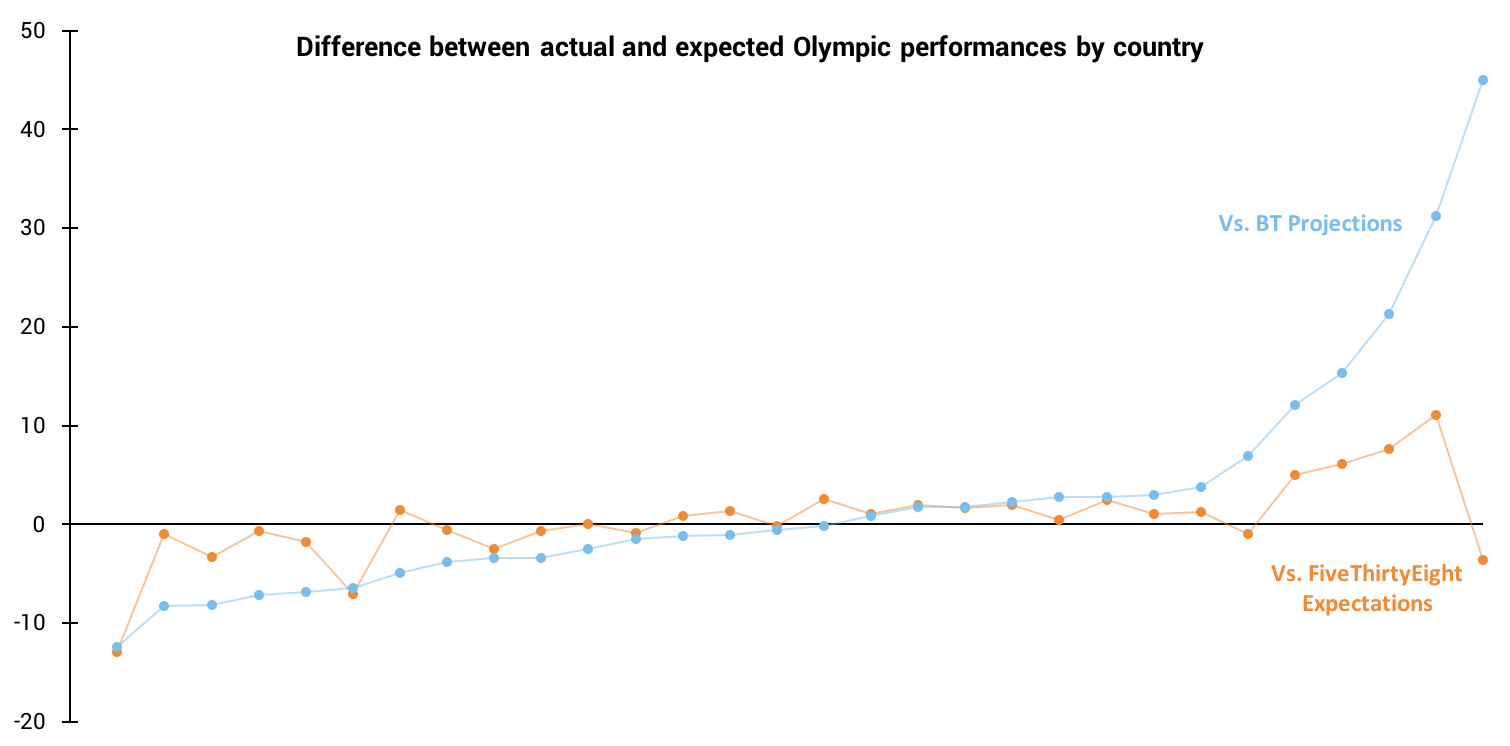
But enough with averages - what about the spread? I decided to look at the spread of how my projections fared by team (by country and sport), by sport, and by country, leading to the visualization below.
Difference Between Actual and Projected Fantasy Points
Off the bat, it appears that while I on average overestimated performances, I more often underestimated teams performances. Of the 199 results included, 119 teams underperformed relative to my projections, but they weren’t crazy far off (on average 1.8 points off). On the other end of the spectrum, the 80 over-performers really outdid themselves, over-performing by 3.5 points on average.
As you can see, this average over-performance is very heavily influenced by the outliers on the right side of the chart, namely the German Nordic Combined team. No matter how you look at the data, the German Nordic Combined team’s projection was the dominate inaccuracy in my projections. Diving into how I could have possibly been so (21.5 points!) off, I saw two issues with my data and model.
In order to make my projections, I pulled data from the official Olympics website, where they have listed past winners for each event. This seemed to be a good place to scrape the historical results I would need for my model, and it seemed to work fairly well. In the process of scraping these results, I did notice that some events had no past results (for example, see the page for men’s individual ski jumping). I shrugged this off and assumed this was because these were new events or were slightly modified from past Games. This was true, but it was a mistake to be so cavalier. It turns out I wasn’t actually pulling in the results for all historical events as I was expecting. This mistake became an issue when my historical results were missing results that would have indicated strong performances in the 2018 Games. For example, my data showed that Germany had only ever won a bronze in Nordic Combined, so one would expect they probably wouldn’t have done amazingly in PyeongChang. However, Germany’s Nordic Combined team actually earned a gold, a silver, and a bronze in just Sochi. Therefore, someone using accurate data probably would have correctly projected that Germany could have won five medals in PyeongChang, as they did. So in a classic newbie fashion, I blindly trusted my data and neglected to account for problems stemming from missing data.
My second mistake was due to a conceptual gap in my model. Using historical performances (which now turned out to be only partially complete), I estimated how each team would fare entirely independently of each other. So if there were five teams that all did okay historically, they would each be projected to do okay in PyeongChang, which makes sense. But one of these teams would have to win the gold, right? This was my oversight. By projecting each team individually (and then not checking my results in the aggregate), I ended up making projections that would indicate no one wins gold. For example, based on my scoring scheme, with three Nordic Combined events, there would be 34.6 total points awarded to Nordic Combined teams. However, my projections said 6.2 points would be awarded, because, based on my incomplete data, no one team had done particularly amazing in the past. Instead, I should have awarded shares of these 34.6 points based on who was mostly likely to come in first, second, and third. If I had done so, I would have projected that the German Nordic Combined team would have earned 25.6 points, which is much closer to the 23.1 points they actually earned.
Overall, while I did make some mistakes, I’m not too upset with the results I got. This served as a good learning experience for how to improve my model for future Games and future projects in general. So lessons learned and onto the next one - 2020, here we come!
Retrospective note (on the retrospective): FiveThirtyEight had their own projection model and they recently published their results. I decided to see how my results compared to theirs (see below for a quick chart). As far better modelers than me, I was expecting their results to blow mine out of the water, and you know what, they kind of do. Our results are on two different scales (theirs are measured by number of medals expected, mine are measured by expected Fantasy Olympic points) so direct comparison is probably not the best analysis, but it is interesting to see that we get similar trends, likely driven by performances that were just truly unexpected. This comparison also further points out how much I messed up Germany (points furthest to the right). Sorry Germany…
This analysis includes teams that were projected to earn points or who did earn points. Thus if a team was not projected to win and they did not win, they are not included.