A Tale of Two Half Marathons
Nov 22 2019
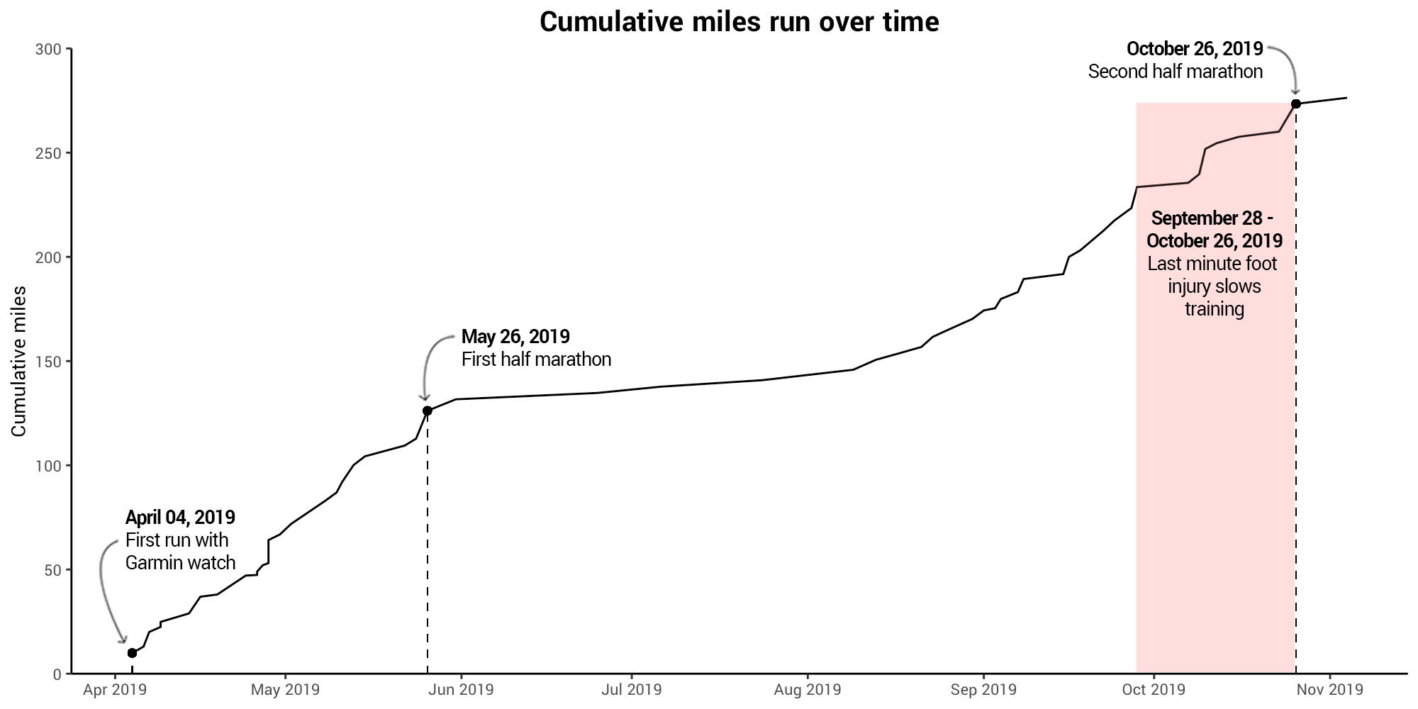
Prior to this year, I had a somewhat love-hate relationship with running. I ran cross country in high school to help train for the hockey season (my main sport), but I never really loved the running as much as some others on the team. In the years since, I forced myself to go on runs as a good form of cardio, but it was always more of chore. Cut to January 2019 when I was convinced to sign up for my first half marathon after being persuaded by a friend (and much better runner). Signing up for the half pressured me into training and once I started training, things started to click a bit more, though I wouldn’t say I was a true runner. This was until I caved and decided to take that next step and really do the running thing: I bought a running watch. The watch really helped my pacing, which I had always had issues with and overall made me enjoy runs quite a bit more. Now, 11 months later, I just wrapped up my second half marathon, because I guess I’ve been converted, possibly all thanks to that sweet running data.
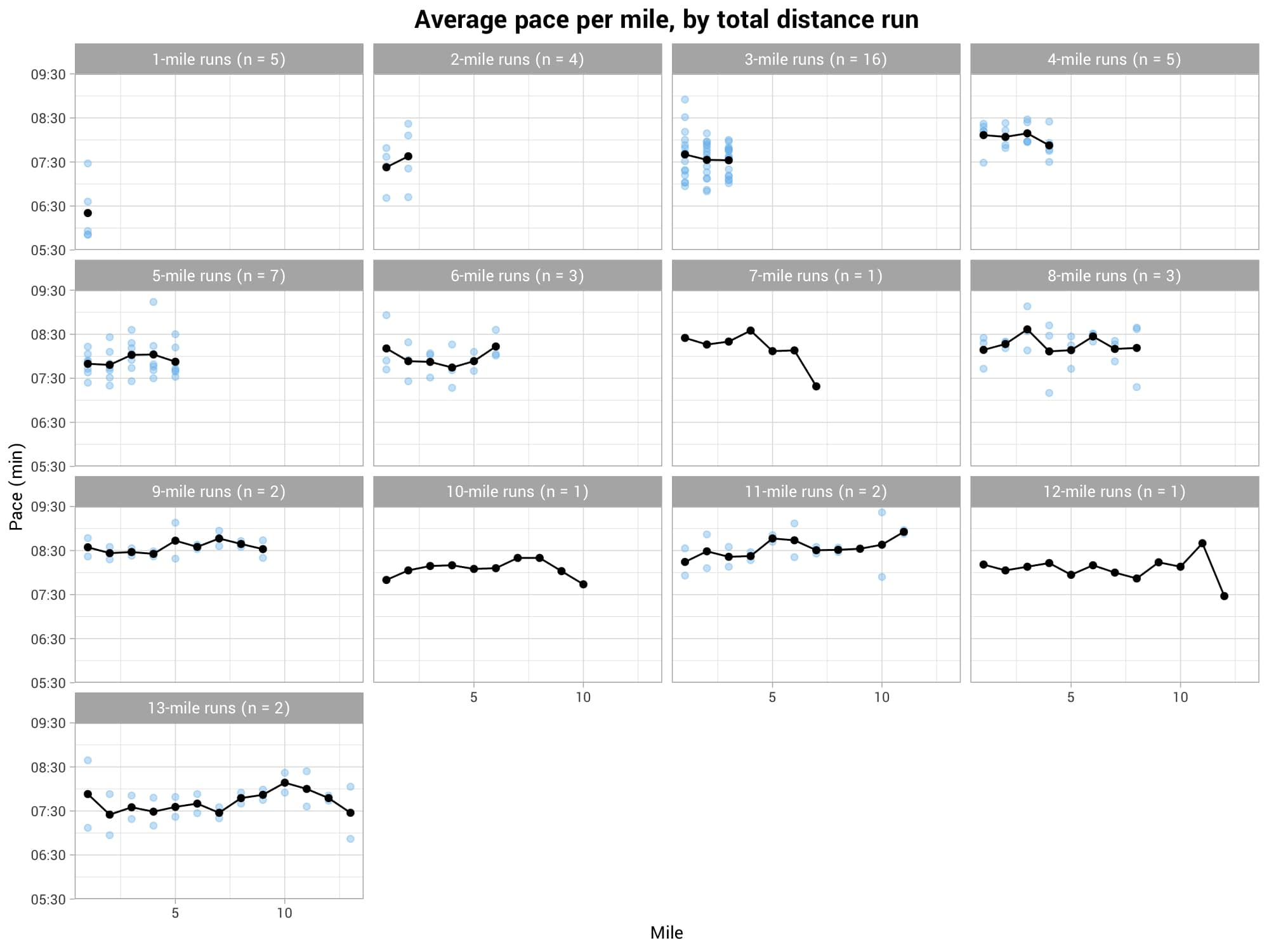
In training for these two races, I logged 58 runs, which comes out to a nice chunk of data. So, now that I’m taking a bit of a break from running for the winter, I wanted to take a look back at all of these runs and see what kind of story these data tell. Thus, I present: A Tale of Two Half Marathons, as told by charts.