
Polar Line Charts in D3
Jan 08 2017
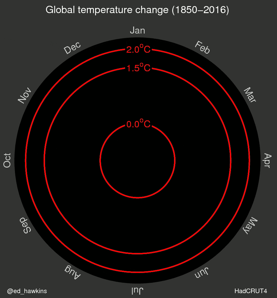
A few weeks ago, I came across this very interesting (and very scary) visualization of the change in global temperatures over the last two centuries. I was particularly impressed with their choice to use a polar chart to show annual changes as opposed to the traditional chart choices.
Since D3 and Mike Bostock have generally implemented every type of chart imaginable, I was surprised that I couldn’t find anything like this sort of polar line chart that I could use for other data sets. As a result, I decided to code it up myself, which you can see below. What better data to show of the chart than the original climate data so that is what you see below.
Now that I have the chart ready to go, I’ll keep my eyes open for other data sets that might work well for this sort of radial chart, and as always, I’ll post it here.