
Best Of "Data is Beautiful" #1
Aug 16 2015
As I briefly mentioned in a previous post, I am a big fan of well-designed representations of data. If you’re also a fan of this “art form” then you should be an avid follower of the subreddit /r/dataisbeautiful. If you’ve never seen it, it’s a must read.
Pretty much all of the posts are cool but there are a few that are definitely a cut above. I decided every once in awhile I’d highlight my personal favorites. So without further ado…
NBA Shot Charts
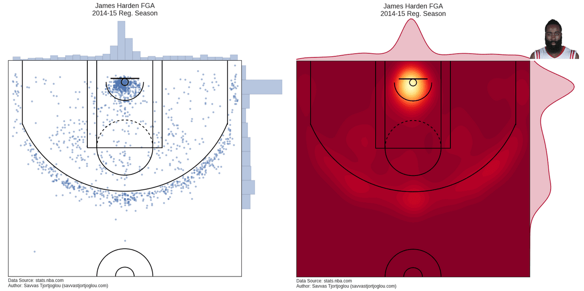
I’m not a huge NBA fan but I do know there is a crazy amount of data available about the game - maybe second only to baseball. I guess Savvas Tjortjoglou decided to map that data to show a very comprehensive shot chart. The post is well-done, especially the way that he actually goes about mapping the data onto the court as singular points and heat maps.
Mapping the UK via Pubs
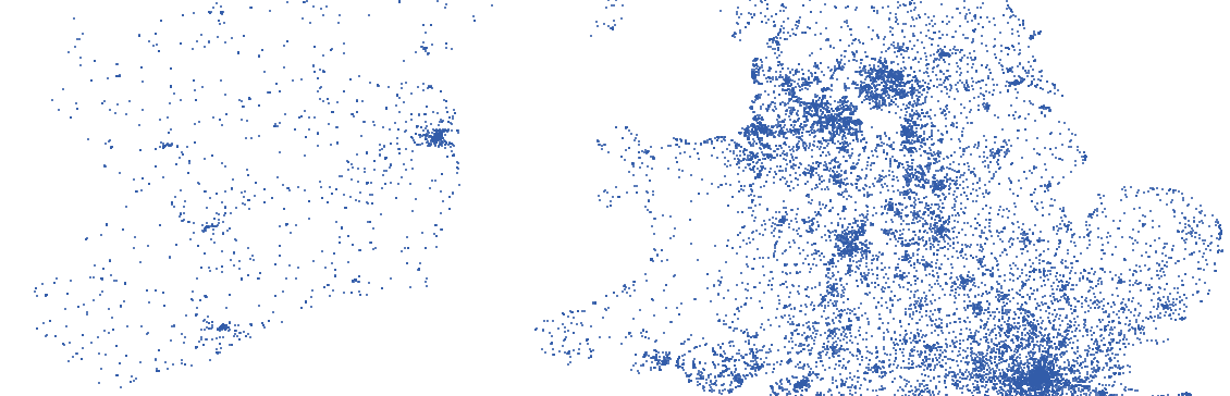
This is just one of those things that will make you LQTY (laugh quietly to yourself, the truer form of LOL). Of course the United Kingdom can be be well mapped through all of its pubs. While not as dense as London, Ireland does a good job of dispersing its drinking establishments. Scotland is just lacking though - come on Scotland! The actual data work being done here is pretty simple but it’s cool nonetheless.
Swearing Across America
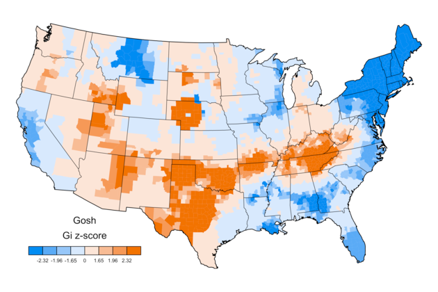
I particularly enjoy this one and everything it has to say about the different regions of the US. Coming from the Northeast, I have to generally agree with the maps - I don’t remember the last time I heard someone say “Gosh” seriously. I was also quite amused by the tiny spike in the use of “Bitch” in Fairfield County Connecticut. Fairfield reppin’!
Rather than using API access like the others, this post also had a pretty interesting way of gathering the data. While I’m still slightly unsure of utilizing Twitter / Geolocation for accurate data science, for the matter of this post I’ll accept their method.
Randomly Finding Someone
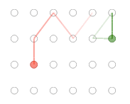
Finally, while not quite as data set driven as the other posts, this post from Empty Pipes features a cool and simple animation to simulate the “randomly searching” process - hurray for pretty gifs. He even built a tool for anyone to try out the tool / animation.
While incredibly simplified, his analysis does seem to be leading in the general right direction for the best method to find someone in a large crowd. Then again this also seems like the perfect opportunity to use Find My Friends or a good ol’ phone call.