
Visualizing Scores at the 2024 Paris Olympics
Aug 10 2024
Tomorrow (Aug 11, 2024) marks the end of the 2024 Paris Olympics, which have kept me thoroughly entertained for the last two weeks. I would consider myself an at-most casual sports fan normally, but I’ve always been a pretty big Olympics fan (see my previous posts) so when the games are on, I am following along in some shape or form pretty much constantly.
One of my favorite parts of the games is popping on a random sport as an opportunity to learn more about and fall in love with a more niche event or new team. Prior to these Olympics, I knew very little about competitive archery, but after my wife and I happened to throw on some women’s team archery matches on day 2 of the games, I was locked in on all things archery. Something similar happened for rugby sevens, surfing, breaking, and a whole slew of other more niche-to-me sports.
NBC/Peacock’s “ongoing” feeds gave a good opportunity for viewers to skip around to all sorts of events, often popping in right when the action is getting good. In these moments of transition, right after Mike Tirico would “send us” to watch the excitement on the court, field, or pool, I was intrigued by how each individual sport’s broadcast would explain, either visually or via commentary, the state of the event. As a data viz nerd, I found myself focusing a lot on how each sport utilized score board graphics and other visual cues to quickly answer one primary questions: “who is winning?”
Most of the Olympic sports do a decent job on this, but some are better than others. So because I seemingly have too much time on my hands now that the games are ending, I decided to go through every single sport in the 2024 Paris Olympics and categorize/rank sports based on how clearly their broadcasts communicate the state of play at any particular moment.
Two upfront notes on this:
(1) This is the very subjective opinion of an already self-admitting “at-most casual sports fan,” so I’m sure some of these takes might be considered naive, missing context/nuance, or just flat out wrong. Please excuse them in those instances.
(2) This categorization and ranking is more focused on how scores and results are communicated to viewers and less on the specifics of what makes for good rules or judging systems. I know not that much about most of these sports and I know even less about the specific minutia that govern how or why a specific athlete scores a specific way. So I’m not opining on the quality of the rules or scoring but more focusing on how clearly those scores are interpreted by a viewer.
For a bit more on specifics of crafting scoring systems for the Olympics, I’d recommend NPR’s Planet Money podcast episode “Will the Olympics break breakdancing?”
Here we go!
🏃🏼♂️🏊🏼♀️🚴🏼♂️ Races
Includes: Athletics (Track); Canoe Sprint; Cycling (BMX Racing, Mountain Bike, Road, Track); Rowing; Sailing; Sport Climbing (Speed); Swimming; Triathlon
I consider races to be the best when it comes to understanding “who is winning” because all you need is a good camera angle and you can see for yourself. At any given moment, if you look at the pool or the track, all you need to see is who is first in the pack and you have your answer.
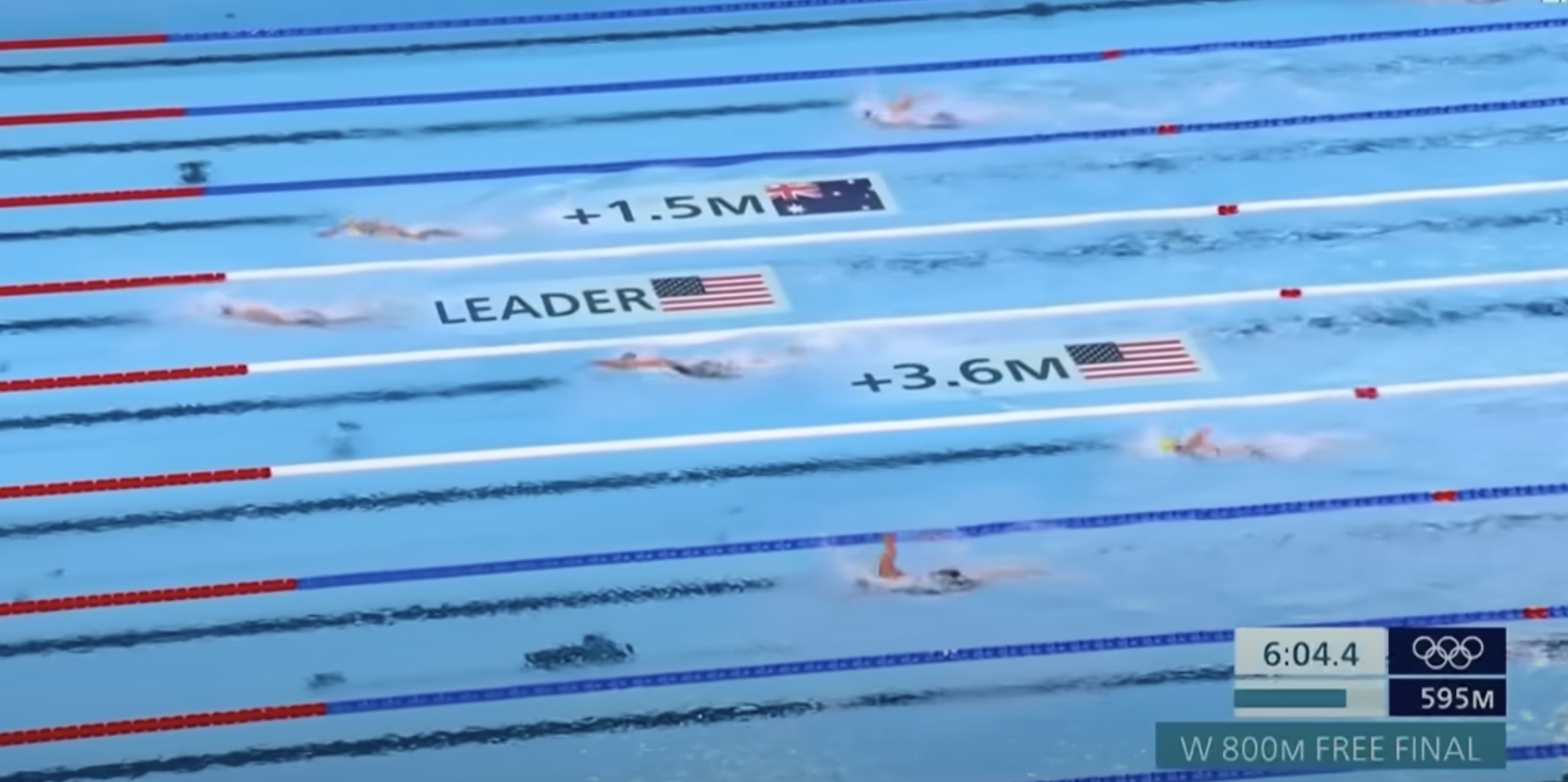
, we can tell from just a photo that Noah Lyles finished first.](/assets/img/posts/paris-olympics-score-boards-83bfc27e.png)
Because the structure of these race events provides a default visual representation of who is winning, this frees up the broadcast to provide additional layers of detail and context to make it an even better viewing experience for the audience. I think the swimming broadcasts especially shine in this regard, with things like the pacing lines for world records, lap times, and the more recent additions of speed and/or lag distances for the top swimmers.
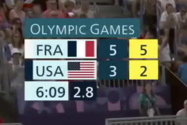
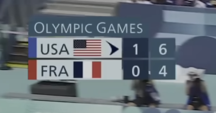
🏀⚽🏒 Real-Time Scoring Events
Includes: Basketball, Football, Handball, Hockey, Rugby Sevens, Water Polo
Behind races, which really don’t require scoreboards at all, real-time scoring events like basketball, football (soccer), and rugby are the easiest to follow along because their scoreboards typically just need to relay the current score (who is winning) and how much real time remains before the score is final.
](/assets/img/posts/paris-olympics-score-boards-814e6c13.png)
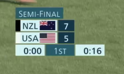
Understanding these events becomes slightly easier if you know some of the core structure of the games (e.g., how many halves/quarters/periods, how long each period is, etc.), but because most of these events count their timing down (except for football), some of that information is already relayed to an uninformed viewer.
I will note that any sports fan, especially the data-interested ones, will tell you that a game’s score is really only part of an event’s story, which I would agree with, and this is true for pretty much all sporting events (not just these real-time scoring ones). Statistics like shots on goal, number of fouls/penalties, or turnovers help to tell a more specific and nuanced story of which team is doing better. But at the end of the day, for this category of real-time scoring events, no matter how many shots on goal or turnovers a team had, the score is all you really need to answer “who is winning?”
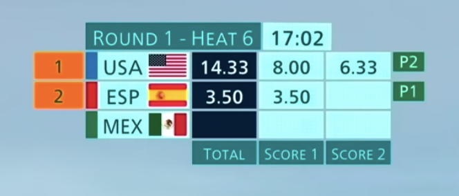
🎾🏐🏹 Set-Based Scoring Events
Includes: Archery, Badminton, Beach Volleyball, Shooting, Table Tennis, Tennis, Volleyball
While I rank set-based scoring events like volleyball or tennis below real-time scoring events, I think most of the positives for events like football or basketball apply to set-based events too. The main thing that bumps set-based events down is the requirement to know how many games and/or sets there are in a match. Real-time events have the benefit of a countdown clock, but to know how far along a match is, you typically need to know that you win a match by, for example, winning two sets and you win a set by winning 25 points. To complicate it, some events like tennis use a different number of sets to win depending on the tournament and a number of events have more nuanced tie-breaking rules…
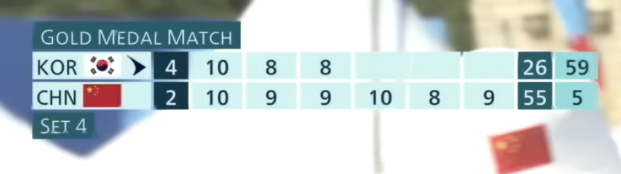
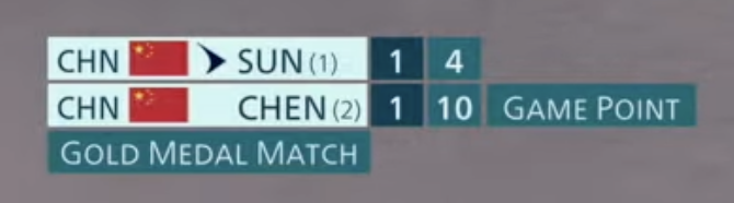
However, with that little bit of extra knowledge to know what all those little numbers mean (and how big they can go up to), I typically view set-based events as fairly easy to follow.
🏇🏼🏋🏼🏌🏼♂️ Objective Turn-Based Events
Includes: Athletics (Field), Golf, Equestrian (Jumping), Sport Climbing (Lead/Boulder), Weightlifting
I went back and forth on the ranking for what I’m calling objective turn-based events like field events (shot-put, discus) and weightlifting, because on paper, it is actually quite easy to look at a ranking table and see why the first placed athlete is in the lead. For shot-put, the distance for each throw is fairly straightforward and intuitive to compare. The same is true for golf, except you want the smallest number instead of the largest.
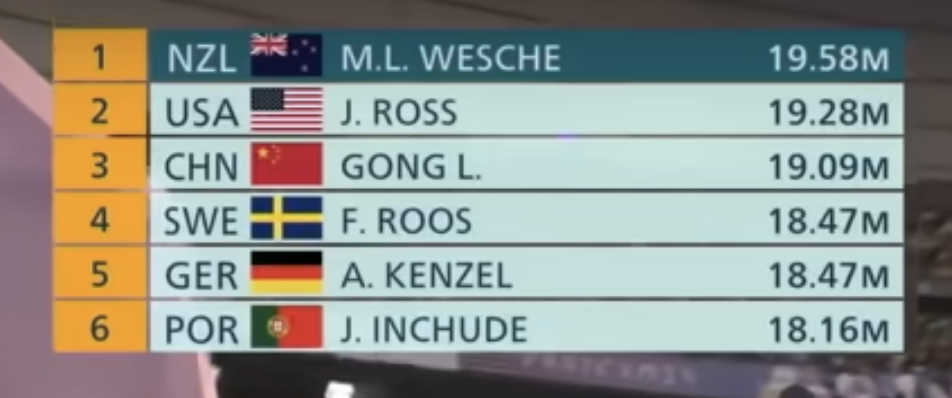
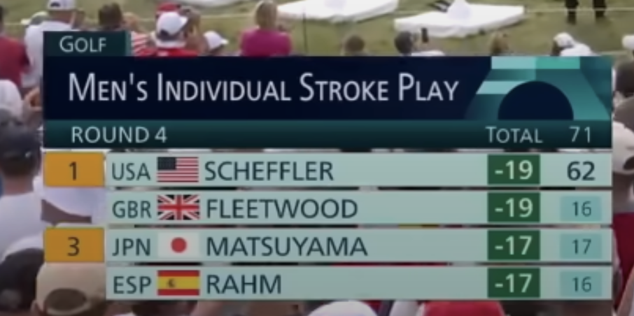
My only real complaint for the scoreboards of these events, and thus the rationale for this position in the ranking, is that the scoreboards are typically just a ranking of the top handful of athletes, which means you can’t get a sense for the whole field, and these ranking tables are typically only shown periodically between athletes. This means that if you were to turn on one of these events, it might take a bit of time for the broadcast to show you the rankings and even still you might not see everyone’s score or even any indication of how many athletes have gone and/or are left.
🥊🤺🤼 Combat Events
Includes: Boxing, Fencing, Judo, Taekwondo, Wrestling
For awhile, I actually had combat events like judo and taekwondo ranked much higher because most of these events offer real-time scoreboards with a pretty clear indication of the score. However, I ultimately bumped these down quite a bit because it can be somewhat hard for a first time viewer to make sense of what the score means and/or how one even scores points. How an athlete scores a point or gets a high score is typically fairly intuitive in the other events listed above, but I’ve always found the actual scoring for combat sports (even those with real-time scoring) to be somewhat unclear with very little visual direction given.
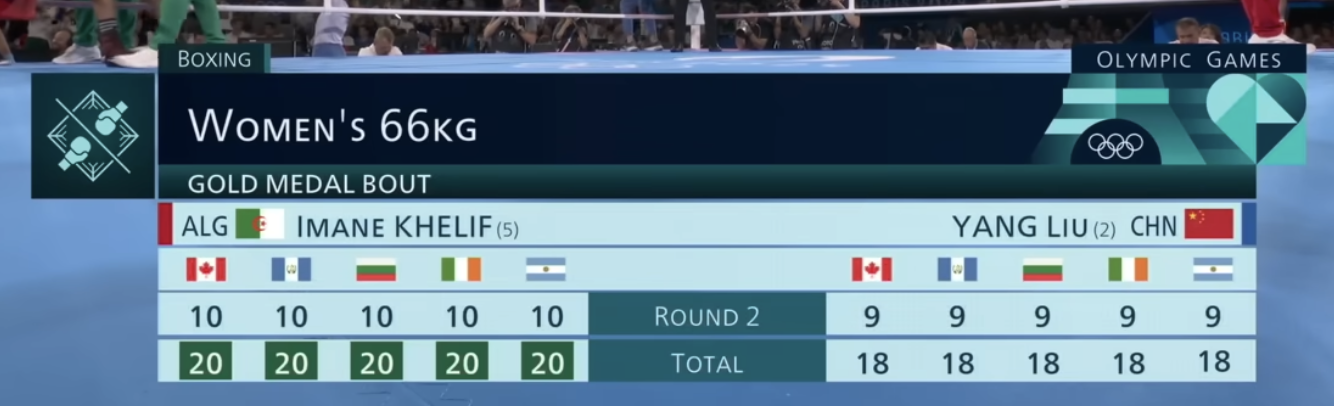
To go one even further, certain combat sports like boxing do not even have real-time score indications, so viewers are typically left waiting for score updates between rounds or at the end of the entire event.
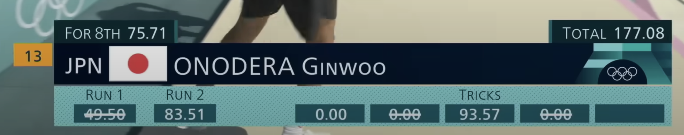
🛹🤸🏼♂️🏄🏼♂️ Judged Turn-Based Events
Includes: Artistic Swimming, BMX Freestyle, Breaking, Diving, Dressage, Gymnastics, Skateboarding, Surfing
This last category of events is a bit more varied in their structure but they suffer from many of the same faults when it comes to visually articulating “who is winning,” and those faults are typically the worst parts of each other category. Most of these judged events have athletes taking turns and then judges will dole out scores after each run, turn, attempt, etc. As a result, these events suffer from:
- Often lack of clarity of why an athlete scores a particular way, similar to the fault I mentioned for combat events
- Scores and/or rankings are typically shown significantly after an attempt/run, with no real time indication of performance, and the full ranking of athlete scores are typically only shown sparingly, similar to the faults I mentioned for objective turn-based events
- The information on structure (as a means to demonstrate progress through the event) is not always shown and/or clear, similar to the fault I mentioned for both objective turn-based and set-based scoring events

All of that being said, there is obviously variance in the clarity for these different sports. I personally think surfing is probably the best/clearest one of these events whereas breaking is probably the worst. Throughout a surfing event, there is a decent amount of information about current status of a competition, even if the rationale for a wave score can be unclear. Meanwhile during a breaking battle, there is no real indication of anything at all, and even after a battle concludes, viewers are really only told who won overall, with very little about who won which round and why.

An additional level of confusion for some of these judged turn-based events comes from trying to show mid-round/mid-competition rankings when not everyone has yet had a equal number of attempts. For example, for street skateboarding competitions, skaters are ranked via a combined score that is a combination of their best singular run score and their two best individual trick scores. So, especially during the earlier parts of the competition, the rankings for these combined scores will often fluctuate a ton simply because some skaters have had more runs, even if they had relatively lower scoring runs.
This problem is especially true in all-around gymnastic competitions since gymnasts are performing different skills at the same time. So as with skateboarding, mid-rotation scores and rankings will vary a ton based simply on if an athlete has gone, but on top of that, since some skills are known to be easier to score higher points on, the gymnasts who perform these skills last will appear to be lagging behind in the rankings, even if they’ll inevitably rise to the top.
While I view this as a problem, I do also understand that it is a complicated one to account for. Simply taking and/or showing averages or other summary statistics for individual scores could help a bit in some moments but it likely would complicate a viewers understanding of how someone actually wins a competition, so the cons would likely outweigh the positives. Given this complexity, maybe I should just ignore this…
* * *
All in all, the IOC, broadcast networks, and each sport’s governing bodies do a pretty decent job to try and make each sport understandable, fair, and fun for audiences, so all of this commentary and ranking is relatively moot in comparison to that hard work. I also want to emphasize that these opinions are not particularly correlated with my actual appreciation of the sport. Skateboarding, gymnastics, and even breaking are actually some of my favorites to watch, so it is with love that I am simply pointing out how they can be (at times) slightly complex to follow in detail. And even if nothing or very little changes in how these sports visually represent their scores, I’ll be following along and loving every moment regardless, because who doesn’t love sport!
For a bit more on sports graphics, especially on the technology of how some of it works and the design iterations involved, I would recommend these videos:
- How the NFL’s magic yellow line works
- The Hidden VFX in Live Sports
- Golf Tech is Hidden in Plain Sight!
See y’all in Milan in 2026!